To ink or not to ink
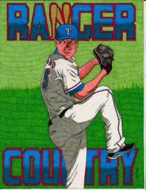
Viewing comments for Page 19 "Ranger Country"a collection of ink marker drawings in 2011
60 total reviews
Comment from MinoYasue
Your sport figures has always such an dynamic pose which is very difficult to portray correctly, but you do so wonderfully; I also like the strong expression �?? show so much concentration. Thank you for sharing.
reply by the author on 29-Oct-2013
  |
Your sport figures has always such an dynamic pose which is very difficult to portray correctly, but you do so wonderfully; I also like the strong expression �?? show so much concentration. Thank you for sharing.
Comment Written 28-Oct-2013
reply by the author on 29-Oct-2013
-
thanks for the great review
Comment from a.samathasena
Very nice beautiful great Art. Colors are very nice and great. Green b/g is very nice.His eyes ,face,action,cloths,green b/g say many great details.Color, Creativity,Art technique and technical and all works are the Best... Thanks.
reply by the author on 29-Oct-2013
|
Very nice beautiful great Art. Colors are very nice and great. Green b/g is very nice.His eyes ,face,action,cloths,green b/g say many great details.Color, Creativity,Art technique and technical and all works are the Best... Thanks.
Comment Written 28-Oct-2013
reply by the author on 29-Oct-2013
-
thanks for the great review
Comment from JB Stevenson
Nice poster, direct and to the point. I like the colors and the action of the pitcher baring down on the batter. Thanks for sharing with FAR.
JB
reply by the author on 06-Jun-2013
|
Nice poster, direct and to the point. I like the colors and the action of the pitcher baring down on the batter. Thanks for sharing with FAR.
JB
Comment Written 05-Jun-2013
reply by the author on 06-Jun-2013
-
thanks for the great review.
Comment from Mollie213
Better than excellent. Your colors and details are perfect.
You have shadowed the proper places for a wonder poster.
Thanks for posting so we all can enjoy
reply by the author on 05-Jun-2013
|
Better than excellent. Your colors and details are perfect.
You have shadowed the proper places for a wonder poster.
Thanks for posting so we all can enjoy
Comment Written 04-Jun-2013
reply by the author on 05-Jun-2013
-
thanks for the great review!
Comment from cainse
Mighty well done. I'm not a ball fan, but I'm quite sure someone better educated in the sport than I would know immediately who this is. The poster is very eye-catching. Excellent impact. Very nice colors. Realistic looking pose. Good use of light and shadow. I am in awe.
reply by the author on 05-Jun-2013
|
Mighty well done. I'm not a ball fan, but I'm quite sure someone better educated in the sport than I would know immediately who this is. The poster is very eye-catching. Excellent impact. Very nice colors. Realistic looking pose. Good use of light and shadow. I am in awe.
Comment Written 03-Jun-2013
reply by the author on 05-Jun-2013
-
the player is no one..i did it generically to represent the team not the indivdual..wink. thanks for the great review!
Comment from joe L
Nice image and ideas . Love the colors and composition . Nice depth of field too . I like the different shads of green . Well Done , with Peace, Joe
This rating does not count towards story rating or author rank.
The highest and the lowest rating are not included in calculations.
reply by the author on 03-Jun-2013
  |
Nice image and ideas . Love the colors and composition . Nice depth of field too . I like the different shads of green . Well Done , with Peace, Joe
This rating does not count towards story rating or author rank.
The highest and the lowest rating are not included in calculations.
Comment Written 03-Jun-2013
reply by the author on 03-Jun-2013
-
thanks joe for the good review!
Comment from Lucien van Oosten
My first thought, Nice depth and perspective with how the player is positioned within the composition, his one leg coming off the page works really well. The way drew him has great feeling of motion , good colors and overall nicely composed. I am not a fan of the bats becoming, or making the "N" but it is still a well drawn image using the media.
reply by the author on 03-Jun-2013
|
My first thought, Nice depth and perspective with how the player is positioned within the composition, his one leg coming off the page works really well. The way drew him has great feeling of motion , good colors and overall nicely composed. I am not a fan of the bats becoming, or making the "N" but it is still a well drawn image using the media.
Comment Written 03-Jun-2013
reply by the author on 03-Jun-2013
-
i tried to be a lil different then..tried with all the letters with bats...nahhh it didnt look good..so i tried the one letter..i did 2 like this and then went to a different approach..i have to agree..thanks for the great review!
Comment from Mara del Mar
Great poster. Love the facial expression, over all the eyes, and the green grass. Great shading too, and nice details. I like the bats that form the N. Well done.
Mara
reply by the author on 05-Jun-2013
|
Great poster. Love the facial expression, over all the eyes, and the green grass. Great shading too, and nice details. I like the bats that form the N. Well done.
Mara
Comment Written 03-Jun-2013
reply by the author on 05-Jun-2013
-
thanks for the great review!
Comment from Jairos
Wow this is Great as always good work here , very good Talent and beautiful colors well done , - jairos
reply by the author on 05-Jun-2013
|
Wow this is Great as always good work here , very good Talent and beautiful colors well done , - jairos
Comment Written 03-Jun-2013
reply by the author on 05-Jun-2013
-
thanks for the great review!
Comment from Alison Ryde
and another one bites the dust.
My you do put a lot on.Like the grassy background.
He looks rather over pink. maybe he is sunburnt.
reply by the author on 20-Jun-2012
|
and another one bites the dust.
My you do put a lot on.Like the grassy background.
He looks rather over pink. maybe he is sunburnt.
Comment Written 19-Jun-2012
reply by the author on 20-Jun-2012
-
thanks alison for the great review.