To ink or not to ink
Viewing comments for Page 19 "Ranger Country"a collection of ink marker drawings in 2011
60 total reviews
Comment from Sam S
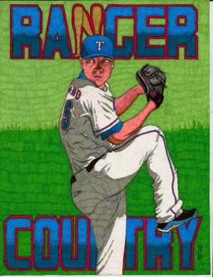
This is a great drawing of the pitcher winding up for his pitch. I like your use of bats for the letter N. Good crisp colors. Well done. Thanks for sharing. Sam
reply by the author on 19-Jun-2012
  |
This is a great drawing of the pitcher winding up for his pitch. I like your use of bats for the letter N. Good crisp colors. Well done. Thanks for sharing. Sam
Comment Written 19-Jun-2012
reply by the author on 19-Jun-2012
-
thanks sam for the great review.
Comment from phil1950
Cool poster I like the different shades of green in the background you can see the intensity and concentration in the eyes the poster is well composed and has good initial impact great colours tones textures technique well done as usual
reply by the author on 19-Jun-2012
|
Cool poster I like the different shades of green in the background you can see the intensity and concentration in the eyes the poster is well composed and has good initial impact great colours tones textures technique well done as usual
Comment Written 18-Jun-2012
reply by the author on 19-Jun-2012
-
thanks phil for the great review.
Comment from MorganCollins
this baseball poster of your would look good as collectable cards. love the colours and poses. well done
reply by the author on 19-Jun-2012
|
this baseball poster of your would look good as collectable cards. love the colours and poses. well done
Comment Written 17-Jun-2012
reply by the author on 19-Jun-2012
-
thanks morgan for the great review.
Comment from goldie-lopez
Your an Rangers fan I see. Such details, in the pitchers face. The eye, mouth(grinning) and the movement of his body. You done a lot of work here.
Center of interest, shadows and details, creative presentation, technique are all very good.
Wonderful work MKflood!
reply by the author on 19-Jun-2012
|
Your an Rangers fan I see. Such details, in the pitchers face. The eye, mouth(grinning) and the movement of his body. You done a lot of work here.
Center of interest, shadows and details, creative presentation, technique are all very good.
Wonderful work MKflood!
Comment Written 17-Jun-2012
reply by the author on 19-Jun-2012
-
i like the rangers but not a fan..my goal eventually do all the major league teams, in between other projects of course. glad that you like and thanks for the great revieww.
Comment from Brian B
Love just about everything about this art piece. Like that you used bats in the word ranger. The look of concentration on his face is perfect. Composition of the shadow on his uniform and how his right leg is on the Y in country. Oh yeah, and Like the dark green grass that goes up to a light green. I guess I have said enough lol.
reply by the author on 19-Jun-2012
|
Love just about everything about this art piece. Like that you used bats in the word ranger. The look of concentration on his face is perfect. Composition of the shadow on his uniform and how his right leg is on the Y in country. Oh yeah, and Like the dark green grass that goes up to a light green. I guess I have said enough lol.
Comment Written 17-Jun-2012
reply by the author on 19-Jun-2012
-
thanks brian for the great review.
Comment from LuToTheWu
Once again, you AMAZE me! I absolutely love your work! The ripples in his uniforms are so clear and makes it look so much better! The expression on his face is awesome too! I love how you used the baseball bats as the 'N'. Job well done!
reply by the author on 19-Jun-2012
|
Once again, you AMAZE me! I absolutely love your work! The ripples in his uniforms are so clear and makes it look so much better! The expression on his face is awesome too! I love how you used the baseball bats as the 'N'. Job well done!
Comment Written 17-Jun-2012
reply by the author on 19-Jun-2012
-
i have my moments..lol. glad that you like nand thanks for the great review.
Comment from KB Photo's
Now this one looks better. I like what you have done with the bats in the name. Great color. Great job.
reply by the author on 19-Jun-2012
|
Now this one looks better. I like what you have done with the bats in the name. Great color. Great job.
Comment Written 17-Jun-2012
reply by the author on 19-Jun-2012
-
thanks kenneth for the great review.
Comment from desertdesperado
I like the action and the letter N, very creative. Also the contrast of brown and blue lets me see the cap. Very realistic and natural flow of lines. Looking forward to a Rockies poster.
reply by the author on 27-Mar-2012
|
I like the action and the letter N, very creative. Also the contrast of brown and blue lets me see the cap. Very realistic and natural flow of lines. Looking forward to a Rockies poster.
Comment Written 27-Mar-2012
reply by the author on 27-Mar-2012
-
rockies are on my list have some in front of them but stay tuned...i have flooded(no pun intended) some more of my baseball and rock art out there..who knows you might run across some more of them..wink..glad that you liked this and do appreciate the great reveiw.
Comment from obriankl
i love the baseball bats as the "N" looks really neat. great job as always. the detail is good and the colors are good
reply by the author on 27-Mar-2012
|
i love the baseball bats as the "N" looks really neat. great job as always. the detail is good and the colors are good
Comment Written 27-Mar-2012
reply by the author on 27-Mar-2012
-
thanks obriankl im glad that you liked this and do appreciate the great reveiw.
Comment from AprilWygant
Fantastic!!! Love your stuff!! You know I am a sports lover and you can see with your passionate ability you are as well! I am overwhelmed with your talent! This is a 10 even if I can only rate a 5! Nice work!
reply by the author on 27-Mar-2012
|
Fantastic!!! Love your stuff!! You know I am a sports lover and you can see with your passionate ability you are as well! I am overwhelmed with your talent! This is a 10 even if I can only rate a 5! Nice work!
Comment Written 27-Mar-2012
reply by the author on 27-Mar-2012
-
thanks again april im glad that you like this and do appreciate the great reveiw.