Seeing Green
Green leaves ,dont want to leave2 total reviews
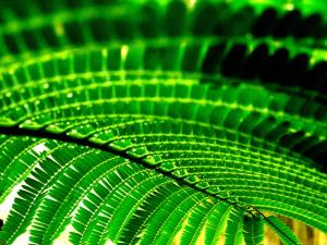
Comment from Lucien van Oosten
I like the flow of the composition and various shades of green that are there. I do think that the blurriness is a little to predominate in the image and that the white at the lower left are a detractor to the image, if that area were gold as it is on the right would be a better visual presentation as I'm seeing it. Nice idea just needs a little more work to get a better balance.
     |
I like the flow of the composition and various shades of green that are there. I do think that the blurriness is a little to predominate in the image and that the white at the lower left are a detractor to the image, if that area were gold as it is on the right would be a better visual presentation as I'm seeing it. Nice idea just needs a little more work to get a better balance.
Comment Written 04-Mar-2012
Comment from Tony B
Super hot abstract work, this limit colors and the flow adds a dramatic effect on this well lit piece. I like the little touch of yellow at the bottom.
|
Super hot abstract work, this limit colors and the flow adds a dramatic effect on this well lit piece. I like the little touch of yellow at the bottom.
Comment Written 04-Mar-2012