Faces of Heroes
Tribute56 total reviews
Comment from GaliaG
excellent piece with excellent initial impact
good technqiue, composition, presentaiton and initial impact
good luck and thanks for sharing
reply by the author on 06-Jun-2012
  |
excellent piece with excellent initial impact
good technqiue, composition, presentaiton and initial impact
good luck and thanks for sharing
Comment Written 05-Jun-2012
reply by the author on 06-Jun-2012
-
thanks galiag for the great review.
Comment from waterboy112
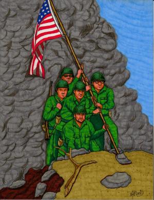
Good work on the smoke looks real. The faces of the men are detailed. The subject is centered and proportional crisp clean flag. The black framed military issue glasses were a good touch.
reply by the author on 06-Jun-2012
|
Good work on the smoke looks real. The faces of the men are detailed. The subject is centered and proportional crisp clean flag. The black framed military issue glasses were a good touch.
Comment Written 05-Jun-2012
reply by the author on 06-Jun-2012
-
thanks bro for the great revieww.
Comment from Shakeadog
a good depiction
very good colour and angle chosen
good detail
perfect contest entry
bright vibrant
good history to do.
reply by the author on 06-Jun-2012
|
a good depiction
very good colour and angle chosen
good detail
perfect contest entry
bright vibrant
good history to do.
Comment Written 05-Jun-2012
reply by the author on 06-Jun-2012
-
thanks shake for the great review.
Comment from donnadiann
A grest version of that heroic moment, and yes I only recently heard of the recreation of the flag raising moment. Your Dad was a hero to have been in WW11, and in Iwo Jima. WW11--they were drafted, had to go, no stress cards thenthey were in for the, and long haul--until it was over. My dad was on the front lines in Germany at 19, and captured four days into the Battle of the Bulge), and remained a prisoner for around four months. He came home, of course--here I am, but the war never left him. I like the vivid bright greens and reds, blues in the drawing. The different pose of the men is interesting and quite alright. Really nice flag and subjects well placed in the frame:)
reply by the author on 05-Jun-2012
|
A grest version of that heroic moment, and yes I only recently heard of the recreation of the flag raising moment. Your Dad was a hero to have been in WW11, and in Iwo Jima. WW11--they were drafted, had to go, no stress cards thenthey were in for the, and long haul--until it was over. My dad was on the front lines in Germany at 19, and captured four days into the Battle of the Bulge), and remained a prisoner for around four months. He came home, of course--here I am, but the war never left him. I like the vivid bright greens and reds, blues in the drawing. The different pose of the men is interesting and quite alright. Really nice flag and subjects well placed in the frame:)
Comment Written 04-Jun-2012
reply by the author on 05-Jun-2012
-
tanks donna for the great review.
Comment from LorrainePurviance
this is a great image, I like it very much, we should never forget the sacrifices the military make for our citizens...great job
reply by the author on 05-Jun-2012
|
this is a great image, I like it very much, we should never forget the sacrifices the military make for our citizens...great job
Comment Written 04-Jun-2012
reply by the author on 05-Jun-2012
-
thanks lorraine for the great review.
Comment from EJEspo
Colors have impact, composition is very good, and the subject is very interesting and tells a good story. I like the diagonals in this image. It makes the composition more dynamic.
reply by the author on 05-Jun-2012
|
Colors have impact, composition is very good, and the subject is very interesting and tells a good story. I like the diagonals in this image. It makes the composition more dynamic.
Comment Written 04-Jun-2012
reply by the author on 05-Jun-2012
-
thanks ejespopc for the great review.
Comment from marieann green
Great entry for the contest. amazingly well done Very much enjoyed the notes. Good colors and composition. Very nicely done
reply by the author on 05-Jun-2012
|
Great entry for the contest. amazingly well done Very much enjoyed the notes. Good colors and composition. Very nicely done
Comment Written 04-Jun-2012
reply by the author on 05-Jun-2012
-
thanks marieann for the great review.
Comment from Reuven Azachi
As a veteran of two wars I cannot but agree with your observations about the horror of wars and the mundane looks of its actors. Your illustration vividly portrays the commonalty of the heroes planting the flag which can be of anybody else among us. Great composing skill, excellent depth and perspective, great choice of color palate and particularly the gray background which symbolizes the dark gray shadow that a war can cast on us all.
reply by the author on 05-Jun-2012
|
As a veteran of two wars I cannot but agree with your observations about the horror of wars and the mundane looks of its actors. Your illustration vividly portrays the commonalty of the heroes planting the flag which can be of anybody else among us. Great composing skill, excellent depth and perspective, great choice of color palate and particularly the gray background which symbolizes the dark gray shadow that a war can cast on us all.
Comment Written 04-Jun-2012
reply by the author on 05-Jun-2012
-
thank you sir for the excellent review.
-
My pleasure, sir.
Comment from pattigirl
Wonderful memorial presentation in this work! Your detail is always excellent, and the composition here is very good. Conveys a poignant tribute to a famous moment in time. Thank you for your notes!
reply by the author on 05-Jun-2012
|
Wonderful memorial presentation in this work! Your detail is always excellent, and the composition here is very good. Conveys a poignant tribute to a famous moment in time. Thank you for your notes!
Comment Written 04-Jun-2012
reply by the author on 05-Jun-2012
-
thanks pattigirl for the great review.
Comment from Lucien van Oosten
I like the different angle you have chosen to draw this historic scene from. the design is really well thought out and I like all aspects of it except for the overwhelming gray in the background, what is it? If it is intended to be smoke a lighter version would have been better so a little of the blues of the sky peeked through. To me it also would have been better if all the flag was in the frame. However, I still like the angle.
reply by the author on 04-Jun-2012
  |
I like the different angle you have chosen to draw this historic scene from. the design is really well thought out and I like all aspects of it except for the overwhelming gray in the background, what is it? If it is intended to be smoke a lighter version would have been better so a little of the blues of the sky peeked through. To me it also would have been better if all the flag was in the frame. However, I still like the angle.
Comment Written 04-Jun-2012
reply by the author on 04-Jun-2012
-
originally i thought about putting the marine corp symbol in the background but thougt it would be to much and yeah..you caught me..the smoke was a last mninute thingy..i think im gonna go back and bring in more different shades of gray...i did rush at the end to get on another project...so yes teacher i screwed up and ill take the ruler on the knuckles so to speaks..lol..wont let it happen again..wink. thanks for the review.
-
you know that Marine emblem idea would be nice. like a ghosting of the emblem in the background, not a in your face one, but a subtle one. would add to the intensity, the emotional string in the viewer of the composition. you are most welcome, grasshopper!!!
cheers,
Lucien