Flowers
Viewing comments for Page 21 "just a touch of green"Different flowers around my home.
78 total reviews
Comment from donkeyoatey
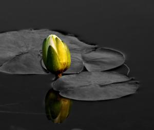
This of course would only work, if the original picture was beautifully sharp, which yours is. A very creative take not only on the green contest but on reflections. I like the very muted reflection on the bottom. Donkeyoatey
reply by the author on 05-Jul-2012
  |
This of course would only work, if the original picture was beautifully sharp, which yours is. A very creative take not only on the green contest but on reflections. I like the very muted reflection on the bottom. Donkeyoatey
Comment Written 05-Jul-2012
reply by the author on 05-Jul-2012
-
Thank you so very much!
Comment from Photowhisper
A fantastic entry into this contest! Really like the selective color! Some don't, but I do! Do not know how! Love the clarity and the composition of this photo! Best of luck in the contest!
reply by the author on 05-Jul-2012
|
A fantastic entry into this contest! Really like the selective color! Some don't, but I do! Do not know how! Love the clarity and the composition of this photo! Best of luck in the contest!
Comment Written 05-Jul-2012
reply by the author on 05-Jul-2012
-
Thank you so very much!
Comment from bebebug
Great pic. I love the vivid color with the desaturated background. Very good to color the reflection also. Makes for an interesting image. Well done!
reply by the author on 05-Jul-2012
|
Great pic. I love the vivid color with the desaturated background. Very good to color the reflection also. Makes for an interesting image. Well done!
Comment Written 05-Jul-2012
reply by the author on 05-Jul-2012
-
Thank you so very much!
Comment from Mary Dreisbach
This is a powerful image. and I love it's composition and refletive quality. Your focus and editing are great! Well done!
reply by the author on 05-Jul-2012
|
This is a powerful image. and I love it's composition and refletive quality. Your focus and editing are great! Well done!
Comment Written 05-Jul-2012
reply by the author on 05-Jul-2012
-
Thank you so very much!
Comment from cabcaster
I have seen several; of these Lilly shots over that last few days, and they have all been superb too. This one is no exception. The pads are clear, and sharp too, as is the bud. The reflection is great too. Well done with this shot. Roy :0)
reply by the author on 05-Jul-2012
|
I have seen several; of these Lilly shots over that last few days, and they have all been superb too. This one is no exception. The pads are clear, and sharp too, as is the bud. The reflection is great too. Well done with this shot. Roy :0)
Comment Written 05-Jul-2012
reply by the author on 05-Jul-2012
-
thank you so very much!
-
While reading my remarks I noticed that I kept using the word "too" please accept my opologies for this. Roy :0)
-
I use the word too also! No need to apoligize, thanks for the good review!
-
Roy :0)
Comment from Ann-Pepper
IT LOOKS LIKE IT CERTAINLY WORKED FOR YOU. THE OVERALL SHARPNESS AND FOCUS COULD BE NO BETTER. THE COMPOSITION AND FRAMING IS VERY NICE. GOOD WORK AND GOOD LUCK IN THE CONTEST. ANN
reply by the author on 05-Jul-2012
|
IT LOOKS LIKE IT CERTAINLY WORKED FOR YOU. THE OVERALL SHARPNESS AND FOCUS COULD BE NO BETTER. THE COMPOSITION AND FRAMING IS VERY NICE. GOOD WORK AND GOOD LUCK IN THE CONTEST. ANN
Comment Written 05-Jul-2012
reply by the author on 05-Jul-2012
-
Thank you so very much!
-
WONDERFUL IDEA...VERY CREATIVE...GOOD WORK,,ANN
Comment from KooLady
It does look oka, love the black back ground and then the leaves are a grey. The green on the pud, with just the white flower showing sets this off. Good work.
reply by the author on 05-Jul-2012
|
It does look oka, love the black back ground and then the leaves are a grey. The green on the pud, with just the white flower showing sets this off. Good work.
Comment Written 05-Jul-2012
reply by the author on 05-Jul-2012
-
Thank you so very much!
Comment from Kenneth Dinkel
Love this simple yet serine and pleasant portrait of the flower bud. The yellow gives excellent contrast to the piece. The reflection is soft and appealing.
reply by the author on 05-Jul-2012
|
Love this simple yet serine and pleasant portrait of the flower bud. The yellow gives excellent contrast to the piece. The reflection is soft and appealing.
Comment Written 05-Jul-2012
reply by the author on 05-Jul-2012
-
Thank you so very much!
Comment from Stacey Nagy
Hey, way to go! This came out nicely! I like the selective color, it really adds emphasis to the green. I like the composition, and where it is placed, and that little touch of green! Very well done!
Stacey
reply by the author on 05-Jul-2012
|
Hey, way to go! This came out nicely! I like the selective color, it really adds emphasis to the green. I like the composition, and where it is placed, and that little touch of green! Very well done!
Stacey
Comment Written 05-Jul-2012
reply by the author on 05-Jul-2012
-
Thank you so very much! Now that I know how I have been having fun playing with it. Some things just don't look good! Thank you again for your input!
-
You are very welcome!
Stacey
Comment from Radstyle
Great effort! Something I would love to learn too, perhaps you could pass the tips on ;) I love the coposition and how the bud is reflected in the black water.
reply by the author on 05-Jul-2012
|
Great effort! Something I would love to learn too, perhaps you could pass the tips on ;) I love the coposition and how the bud is reflected in the black water.
Comment Written 05-Jul-2012
reply by the author on 05-Jul-2012
-
Thank you so very much! It is done in layers. The background layer is in color and the other is in black and white. Then you erase the part you want in color.