
Flowers & Still Life
Viewing comments for Page 25 "In the Pink"Arty Flowers
48 total reviews
Comment from amfunny
Gorgeous. This just pops right out there. Excellent choice of colors. Very beautifully done. Good detail in this.
reply by the author on 21-Jan-2013
  |
Gorgeous. This just pops right out there. Excellent choice of colors. Very beautifully done. Good detail in this.
Comment Written 20-Jan-2013
reply by the author on 21-Jan-2013
-
Thank you so very very much, Norma Jean, for the beautiful review and rating. Both are really really appreciated. :)
Comment from Cassandra01
A very beautiful rendering of this gorgeous butterfly on these brilliant blooms. Really nice technique that really has huge initial impact. Great work.
reply by the author on 18-Jan-2013
 |
A very beautiful rendering of this gorgeous butterfly on these brilliant blooms. Really nice technique that really has huge initial impact. Great work.
Comment Written 17-Jan-2013
reply by the author on 18-Jan-2013
-
Thank you so very very much, Cassandra. :)
Comment from Skyangel02
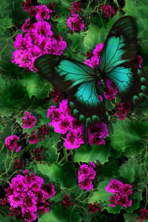
The pink flowers stand out very well against the green foliage.
The butterfly tube is a nice addition to the flowers.
Overall the picture is very lovely but for a macro art contest I would have liked to see something a lot closer up.
Take a look at some macro photography as reference and you will see how much closer they are than just a closeup photo.
There are not many real macro pictures in this contest so far.
Very lovely work but it's not a macro in my opinion.
reply by the author on 18-Jan-2013
  |
The pink flowers stand out very well against the green foliage.
The butterfly tube is a nice addition to the flowers.
Overall the picture is very lovely but for a macro art contest I would have liked to see something a lot closer up.
Take a look at some macro photography as reference and you will see how much closer they are than just a closeup photo.
There are not many real macro pictures in this contest so far.
Very lovely work but it's not a macro in my opinion.
Comment Written 17-Jan-2013
reply by the author on 18-Jan-2013
-
Thank you so much for taking the time to comment on this, Skyangel. I'm well aware what macro means, but the butterfly was the best I had in the hour before the contest deadline. What one enters into a contest shouldn't be the concern of the reviewer. That concern should be left for the voting booth. A piece of artwork should be rated and reviewed as it stands--not because one thinks it doesn't fit contest criteria.
-
The reviewers and the voters are the same people in member created contests.
Whether a work fits the contest criteria plays an important part in voting and reviewing. At least it does to some people. I am one of them. I think if we create a work specifically for a contest we should do our best to make it fit all contest criteria to the best of our ability.
Last year I entered a work in the macro contest and my work was quite ordinary and nothing special. In the contest there were a couple of other art works which which were far superior to mine but hardly anyone voted for them because they were not macro pictures. Surprisingly to me, mine won the contest in spite of being inferior work because it was one of the very few macro pictures in the contest. I told the artists who did the superior work to mine the same as I am telling you. Paint or draw something smaller and make it look larger and you will have a far better chance of winning the contest. ;-)
Comment from Daliant
Very eye at hing. Love the use of colour. They work so well against each other. Great composition beautiful butterfly thanks for sharing
reply by the author on 18-Jan-2013
|
Very eye at hing. Love the use of colour. They work so well against each other. Great composition beautiful butterfly thanks for sharing
Comment Written 17-Jan-2013
reply by the author on 18-Jan-2013
-
Thank you ever so much for the wonderful comments and special rating, Daliant. :)
Comment from corrinas creations
this is ever so pretty, love the bursts of pink everywhere. The colours complete each other so well, the composition is lovely and well its just faultless. Good luck with the contest
reply by the author on 18-Jan-2013
|
this is ever so pretty, love the bursts of pink everywhere. The colours complete each other so well, the composition is lovely and well its just faultless. Good luck with the contest
Comment Written 17-Jan-2013
reply by the author on 18-Jan-2013
-
Thank you so very very much, Corrina. :)
Comment from ALSvec54
OKAY, this picture has grown on me, at first glance I thought it was unnecessary to enhance the colors of a butterfly but then I studied it and love the fluorescence of the plants and the butterfly. The focus is superb and even without any treatment you have a good photograph. The effect you gave it made it more interesting, I could see this as a poster or even a fabric design for a Hawaiian Shirt.
reply by the author on 17-Jan-2013
|
OKAY, this picture has grown on me, at first glance I thought it was unnecessary to enhance the colors of a butterfly but then I studied it and love the fluorescence of the plants and the butterfly. The focus is superb and even without any treatment you have a good photograph. The effect you gave it made it more interesting, I could see this as a poster or even a fabric design for a Hawaiian Shirt.
Comment Written 17-Jan-2013
reply by the author on 17-Jan-2013
-
Thank you ever so much, ALS. Although I don't work with photos, I do appreciate you taking the time to view and review. The colors are inhanced as such because it's a digital painting--no photo work. I can see why you'd give a 4.5 with that in mind. :)
-
Thanks for educating me, I need to do more research into digital painting as this is really incredible.
Comment from susanlen
Such a pretty image with lots of vibrant colours. The magenta blooms are particularly attractive and jump from the frame. I like the leaves too which have cut-out along their edges and also white veins which are very clear to see. These add a lot of interest to the image. The butterfly is spectacular in turquoise blue and black. I like the composition a great deal. The work is visually very appealing. Good Luck in the contest.
reply by the author on 18-Jan-2013
|
Such a pretty image with lots of vibrant colours. The magenta blooms are particularly attractive and jump from the frame. I like the leaves too which have cut-out along their edges and also white veins which are very clear to see. These add a lot of interest to the image. The butterfly is spectacular in turquoise blue and black. I like the composition a great deal. The work is visually very appealing. Good Luck in the contest.
Comment Written 17-Jan-2013
reply by the author on 18-Jan-2013
-
Thank you ever so much for the wonderful review, Susan. :)
Comment from FLYBOBROV
Green has always been my favorite color and the use of it here is simply beautiful. This is truly pleasing on the eyes. With the light purple flowers gives the piece great flavor.
|
Green has always been my favorite color and the use of it here is simply beautiful. This is truly pleasing on the eyes. With the light purple flowers gives the piece great flavor.
Comment Written 17-Jan-2013
Comment from TM.Lawrence
Nice digital art work. The purple flowed pop out and complement the brilliant teal tones in the butterfly. The green in the leaves has a spiderweb feel that supports the purple and teal nicely. Very nice crispness to the image. Amazing in detail captured in the supporting veins of the green flowers. The purple flowers were a good choice to center the piece and frame it. Well done in placing a few purple flowers right by the butterfly. They bring your eye to the butterfly. I don't think the price would be as strong if you didn't place the purple flowers in the top center of the butterfly. But I must say what great detail you provided in the supporting green leaves. I love the details of the leaf veins. Very nice digital art and it looks like a traditional drawing too . Well done.
|
Nice digital art work. The purple flowed pop out and complement the brilliant teal tones in the butterfly. The green in the leaves has a spiderweb feel that supports the purple and teal nicely. Very nice crispness to the image. Amazing in detail captured in the supporting veins of the green flowers. The purple flowers were a good choice to center the piece and frame it. Well done in placing a few purple flowers right by the butterfly. They bring your eye to the butterfly. I don't think the price would be as strong if you didn't place the purple flowers in the top center of the butterfly. But I must say what great detail you provided in the supporting green leaves. I love the details of the leaf veins. Very nice digital art and it looks like a traditional drawing too . Well done.
Comment Written 17-Jan-2013
Comment from phil1950
Beautiful digital painting that is pleasing to the eye great subject composition initial impact technique detail colours tones blending harmony well created.
|
Beautiful digital painting that is pleasing to the eye great subject composition initial impact technique detail colours tones blending harmony well created.
Comment Written 17-Jan-2013