Autumn in the Forest
Autumn Colors28 total reviews
Comment from Lynnette Smallwood
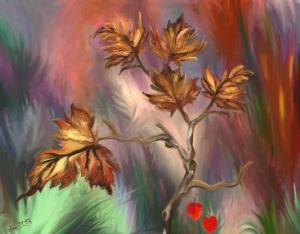
Good job, the technique is great, I love the background, it looks like you have created layers of leaves and shadow creating lots of depth. The pink isn't something I would have put with warm colours however it works. Great job.
reply by the author on 21-Oct-2013
  |
Good job, the technique is great, I love the background, it looks like you have created layers of leaves and shadow creating lots of depth. The pink isn't something I would have put with warm colours however it works. Great job.
Comment Written 21-Oct-2013
reply by the author on 21-Oct-2013
-
Thank you very much!!!
I have changed to a different version which was not ready when I posted. If you have the time may you could have a look and tell me how you like it?
I did not like the pinks myself, they were not intended, but an accident happen when I was working on the layer and lightened the middle up. My false. I did not check. My eyes are to bad and my screen to little to work whole pictures. I work usually in nine squares. Well when I finally looked at the picture I saw the damage. A repair like this needs care and time do to the opacity of the layers. I posted in order not to miss the deadline.
-
I like the pink it makes it stand out from the ordinary, it is different but it works.
-
How it is now, Just in the center, I am satisfied. To have it in the corners too, was just to much. I am still working on the right upper, but the deadline cut me.
Comment from Lynda Joyce
This is digital? I'm amazed at what you can do with a computer. Very pretty colors and detail. Thanks for sharing.
reply by the author on 21-Oct-2013
|
This is digital? I'm amazed at what you can do with a computer. Very pretty colors and detail. Thanks for sharing.
Comment Written 20-Oct-2013
reply by the author on 21-Oct-2013
-
Yes, It is digital but painted in a fashion I would use on canvas. Its done ion ArtRage. This program enables me to chose texture of canvas, kind of paint [Oil in this case], mixing of colors and the use of different size and shaped brushes [hard, soft, round, square] and many other options simulating traditional art. There are, according to the size, hundreds, sometimes thousands of brush strokes in a picture.
-
That is wonderful that you can do that!
-
It is :-) Best thing, I can work everywhere and get not splattered with colors anymore :-)
-
I used to paint and have figured out how much quicker photography is. So, I haven't painted in awhile. That looks like fun.
-
It is fun, but needs lots of time. I personally paint longer on those digitals than I would with oil on canvas
-
You know, that doesn't really surprise me. Do you speed up a little as you get to know it better?
-
Yes and know. I started 2007, with simple paintings in small format, 72 ppi [[pixels per inch] and just one or two layers. Now I am working bigger formats [8"x 10" or bigger} at 400 ppi for high quality canvas print in many layer. I did speed up with experience, but that dos not mean that I need less time.
Comment from M. Celeste
Such beautiful spring-like colors to offset the brown leaves of fall. I love the tone and detail of the leaves. Great arrangement and the pop of red is a treat. Very nice job.
reply by the author on 21-Oct-2013
|
Such beautiful spring-like colors to offset the brown leaves of fall. I love the tone and detail of the leaves. Great arrangement and the pop of red is a treat. Very nice job.
Comment Written 20-Oct-2013
reply by the author on 21-Oct-2013
-
Thank you very much for your encouraging review!
Comment from Geokat
I don't have a clue how you do this, but I find it very nicely done and interesting. I like the detail in the smear look, to refer to the look of it with its multi color background. Great lighting.
reply by the author on 20-Oct-2013
|
I don't have a clue how you do this, but I find it very nicely done and interesting. I like the detail in the smear look, to refer to the look of it with its multi color background. Great lighting.
Comment Written 20-Oct-2013
reply by the author on 20-Oct-2013
-
Thank you very much, also for providing the name for the style. I like smear look. I didn't no how to call it, but smear got it. LOL
Comment from Mara del Mar
Excellent technique of digital painting, I like the texture and great lighting, like the design of the leaves and beautiful tones of color, nice background and excellent composition. Well done
Mara
reply by the author on 20-Oct-2013
|
Excellent technique of digital painting, I like the texture and great lighting, like the design of the leaves and beautiful tones of color, nice background and excellent composition. Well done
Mara
Comment Written 20-Oct-2013
reply by the author on 20-Oct-2013
-
Thank you very much. I appreciate your review.
Comment from Elicia
This is really nice. I like how the colors blended together to give you a very soft, feathery effect. Hope you do well in the contest.
reply by the author on 20-Oct-2013
|
This is really nice. I like how the colors blended together to give you a very soft, feathery effect. Hope you do well in the contest.
Comment Written 20-Oct-2013
reply by the author on 20-Oct-2013
-
Thank you very much for your kind review and wishes.
Comment from Mollie213
I really like this.
It is work well done.
But, I do not like the red you have added as it distracts to me. If they were perhaps a pink or purple to go along with your color scheme, it would look much better in my opinion. And that is what it is, my opinion. But beautiful work
reply by the author on 20-Oct-2013
|
I really like this.
It is work well done.
But, I do not like the red you have added as it distracts to me. If they were perhaps a pink or purple to go along with your color scheme, it would look much better in my opinion. And that is what it is, my opinion. But beautiful work
Comment Written 20-Oct-2013
reply by the author on 20-Oct-2013
-
Thank you Molly, I appreciate your review and your input. Sorry, I cannot change the red color. Those seedpods come only in this red. [Hozuki aka Japanese Lantern, Winter Cherry u.a.] They are often used In dry autumn arrangements with the deciduous Oak leaves.] They are maybe placed on the wrong place.] If I paint another version I could move the seed pods. I will try that, but be patient I am a slow worker.
Comment from susanlen
The colours in this work are very pleasing to my eyes. I get the feeling of movement as though the wind is rushing through the landscape, disturbin grasses and also the tree which is the main subject. I like the shape of your tree and also its leaves. It now shows autumn colours so very apt for the contest. The only thing that bothers me are the two chinese lanterns in the bottom corner. I personally think they are surplus to requirements and do not fit in with the overall image. Their colours are much too bright considering the other tones you have used. Good Luck in the contest at voting time.
reply by the author on 20-Oct-2013
|
The colours in this work are very pleasing to my eyes. I get the feeling of movement as though the wind is rushing through the landscape, disturbin grasses and also the tree which is the main subject. I like the shape of your tree and also its leaves. It now shows autumn colours so very apt for the contest. The only thing that bothers me are the two chinese lanterns in the bottom corner. I personally think they are surplus to requirements and do not fit in with the overall image. Their colours are much too bright considering the other tones you have used. Good Luck in the contest at voting time.
Comment Written 20-Oct-2013
reply by the author on 20-Oct-2013
-
Thank you very much for your kind review and your suggestion. I have a different slight different version painted, where I moved the Chinese Lanterns and slightly darkened the color. I think they were out of place in the previous post I had cropped from the originally bigger painting.
Thank you again for your input and also for the contest wishes.
Comment from FBI GUY
Rich, beautiful and elegant. The central figure of the branch with its bronze leaves is a standout. The background colors and awesome. The application of the shading creates a whirlwind of colors that look like the wind is swirling them throughout the canvas. Not sure what the red hearts or cherries are for other than a [pop of color.
reply by the author on 20-Oct-2013
|
Rich, beautiful and elegant. The central figure of the branch with its bronze leaves is a standout. The background colors and awesome. The application of the shading creates a whirlwind of colors that look like the wind is swirling them throughout the canvas. Not sure what the red hearts or cherries are for other than a [pop of color.
Comment Written 20-Oct-2013
reply by the author on 20-Oct-2013
-
Thank you very much for your kind and through review. The red things are seed pots of Japanese Lanterns [Physalis alkekengi]. I just posted another version where those are moved and slightly darkened. The were out of place because I had cropped the previous version from a bigger picture.
Comment from CMNash
First of all, I love the background on this painting. All the different shades of colors that blending so very nicely to create this beautiful background. And then in the foreground you have painted with great detail those leaves on the branch that looks amazing. I really like the different shades of color you used on each leaf to give it depth and definition. I think you have done a fantastic job with this one. Beautiful.
reply by the author on 20-Oct-2013
|
First of all, I love the background on this painting. All the different shades of colors that blending so very nicely to create this beautiful background. And then in the foreground you have painted with great detail those leaves on the branch that looks amazing. I really like the different shades of color you used on each leaf to give it depth and definition. I think you have done a fantastic job with this one. Beautiful.
Comment Written 20-Oct-2013
reply by the author on 20-Oct-2013
-
Thank you! I appreciate your kind and encouraging review very much.
-
You are so very welcome, it's a very nice piece of art work.