Misc.
Viewing comments for Page 102 "The River Front"This is just different picturs.
52 total reviews
Comment from Lethal005
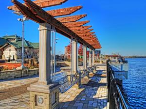
what is tone mapping? looks like another name for HDR effect
whatever it is it works so well here
theres a bit of a junk pile in the b/g behind there haha, which brings some contrast i guess but i wouldve tried to leave that out and concentrate on the open waterits a great angle youve shot from but my eyes want to travel to the open water to see the view out there
very nice, but for a postcard, needs some touching up, im not convinced to come here, that mess behind there by that green roof is off putting, those trees with bright red leaves there, i want to see them, they look nice, try and add them in the frame somehow yeah?
reply by the author on 09-Nov-2013
  |
what is tone mapping? looks like another name for HDR effect
whatever it is it works so well here
theres a bit of a junk pile in the b/g behind there haha, which brings some contrast i guess but i wouldve tried to leave that out and concentrate on the open waterits a great angle youve shot from but my eyes want to travel to the open water to see the view out there
very nice, but for a postcard, needs some touching up, im not convinced to come here, that mess behind there by that green roof is off putting, those trees with bright red leaves there, i want to see them, they look nice, try and add them in the frame somehow yeah?
Comment Written 09-Nov-2013
reply by the author on 09-Nov-2013
-
Thank you so very much! Tone mapping is a program used in Photomatrix, an HDR program.
Comment from BirdsEyeView
good work, the color and tones good, the detail and textures are nice with good presentation. nice field of view. BEV
reply by the author on 09-Nov-2013
|
good work, the color and tones good, the detail and textures are nice with good presentation. nice field of view. BEV
Comment Written 09-Nov-2013
reply by the author on 09-Nov-2013
-
Thank you so very much!
Comment from Echo7
Hey bud, Okay i got your message...i will help as much as i can..did you use a single image here? or a few exposures?. Looks like just the one...as cloudless skies can cause a problem when using HDR....unless you have worked with it for a good time...or depending on your exposures.
I personally think it s a very good photo. Im not commenting on things such as composition, exposure, focus etc,...because i already know you have a great understanding of them & wouldnt submit anything with poor aspects.
So onto the HDR. If you dont know what tonemapping stands for...its when it it maps your image with local contrast, it will achieve the maximum contrast for that scene. But it can also create colour casts, Pavement shadows & stainless steel have adopted a colour cast(Blue). Its not that noticable but its one to look out for. As for the maximum contrast....see how well everything is illuminated...But taking away too many shadows leaves it looking a little less realistic...which is good or bad...depending on what your trying to achieve. Works here.
Try not to use the colour or temprature settings when using Photomatix. Use Photoshop for that. Gives you much more realistic colouring. Photomatix can have a cotton candy vibrance to it. Works well for sunsets....but not architecture.
All the sliders on Photomatix have massive control over your final image. Microcontrast & light spacing the most important.
If you want to see excatly how i use it...from the multiple exposures , settings i use...let me know. I will make a comcast video...showing you a video of my exact computer screen & what im doing. I will put my microphone on & record what im saying.
Hope that helps. Its a great shot btw///really good.
reply by the author on 09-Nov-2013
|
Hey bud, Okay i got your message...i will help as much as i can..did you use a single image here? or a few exposures?. Looks like just the one...as cloudless skies can cause a problem when using HDR....unless you have worked with it for a good time...or depending on your exposures.
I personally think it s a very good photo. Im not commenting on things such as composition, exposure, focus etc,...because i already know you have a great understanding of them & wouldnt submit anything with poor aspects.
So onto the HDR. If you dont know what tonemapping stands for...its when it it maps your image with local contrast, it will achieve the maximum contrast for that scene. But it can also create colour casts, Pavement shadows & stainless steel have adopted a colour cast(Blue). Its not that noticable but its one to look out for. As for the maximum contrast....see how well everything is illuminated...But taking away too many shadows leaves it looking a little less realistic...which is good or bad...depending on what your trying to achieve. Works here.
Try not to use the colour or temprature settings when using Photomatix. Use Photoshop for that. Gives you much more realistic colouring. Photomatix can have a cotton candy vibrance to it. Works well for sunsets....but not architecture.
All the sliders on Photomatix have massive control over your final image. Microcontrast & light spacing the most important.
If you want to see excatly how i use it...from the multiple exposures , settings i use...let me know. I will make a comcast video...showing you a video of my exact computer screen & what im doing. I will put my microphone on & record what im saying.
Hope that helps. Its a great shot btw///really good.
Comment Written 09-Nov-2013
reply by the author on 09-Nov-2013
-
Thank you so very much! This is a single image. I adjusted contrast and brightness with Elements. Then I used Topaz adjust for the detail enhancement but not too much, then I used photomatrix for the tone mapping I used the default one then After that I used topaz adjust again. I doubt I will be doing the three exposures yet as I want to know how to do this one first. I would like your instructions though as any instruction from you would be of great value! You say the color settings work well with sunsets? That is good news! I have found though that there is more pictures that it won't work with than will. I really do appreciate you taking the time to help me! Will you send the instruction video by email? My address wnp20@yahoo.com
Comment from Snopaw
Very nice work Willie, really has an HDR look to i, impressive :) I would suggest one of two things. One would be to select the sky, save it as a layer, process the rest and then process the sky alone. That would prevent the haloing that often comes with such processing. The other would be to take the time to clone out the haloing where it is really obvious. Fun and good work :) Shirley
reply by the author on 09-Nov-2013
|
Very nice work Willie, really has an HDR look to i, impressive :) I would suggest one of two things. One would be to select the sky, save it as a layer, process the rest and then process the sky alone. That would prevent the haloing that often comes with such processing. The other would be to take the time to clone out the haloing where it is really obvious. Fun and good work :) Shirley
Comment Written 09-Nov-2013
reply by the author on 09-Nov-2013
-
Thank you so very much! I know how to work with layers in Elements but there is none in photomatrix that I could find. I have processed in separate layers using topaz but it is a filter. This program is another program.
Comment from RochelleW
Wow, this is a spectacularly beautiful shot, and I wouldn't change a thing. The architecture is beautiful. I love the movement of the water. This would be a great place to sit peacefully and just enjoy the breeze, and the warmth of the sun. Great detail and DOF. Great photo. The lighting and colors are so bright and vivid. You've framed it perfectly. You're depth of focus is amazing. Great job!!!
reply by the author on 09-Nov-2013
|
Wow, this is a spectacularly beautiful shot, and I wouldn't change a thing. The architecture is beautiful. I love the movement of the water. This would be a great place to sit peacefully and just enjoy the breeze, and the warmth of the sun. Great detail and DOF. Great photo. The lighting and colors are so bright and vivid. You've framed it perfectly. You're depth of focus is amazing. Great job!!!
Comment Written 09-Nov-2013
reply by the author on 09-Nov-2013
-
Thank you so very much! these swings are all along the water front and it is a great place to sit and watch the river traffic.
Comment from websterjames
The color and detail here is so rich. Is the blue sky a result of a filter or your use of Topaz / Photomatrix. Regardless it is brilliant as is the details throughout your very enjoyable riverfront photo
reply by the author on 09-Nov-2013
|
The color and detail here is so rich. Is the blue sky a result of a filter or your use of Topaz / Photomatrix. Regardless it is brilliant as is the details throughout your very enjoyable riverfront photo
Comment Written 09-Nov-2013
reply by the author on 09-Nov-2013
-
Thank you so very much!
Comment from jerrid
Omg moonlight was one of the first places you took me out to eat at when we first met. The next time I am down there we must go there to eat!
But this picture rocks. The color and the focus is really good.
Keep up the awesome work. Love ya daddy!
reply by the author on 09-Nov-2013
|
Omg moonlight was one of the first places you took me out to eat at when we first met. The next time I am down there we must go there to eat!
But this picture rocks. The color and the focus is really good.
Keep up the awesome work. Love ya daddy!
Comment Written 09-Nov-2013
reply by the author on 09-Nov-2013
-
Thank you so very much! Love you too!
Comment from julika
I am not familiar with Photomatrix for tone mapping but it obviously produces some nice results. The colours are very striking and somewhat unreal. It depends on he purpose of the shot- to hang it in my living room- I would find some of the colour tones too jarring BUT as you say for postcards-ANOTHER MATER. For that purpose it is excellent!! I like a bright, cheerful card if I were to advertise the amenities of this location.As to your composition- it is excellent. The parallel lines of railing, shadow on the walkway and pillars creates great symmetry. Very effectively done.Nice division of thirds into water, walkway and buildings . A very fine shot.
reply by the author on 09-Nov-2013
|
I am not familiar with Photomatrix for tone mapping but it obviously produces some nice results. The colours are very striking and somewhat unreal. It depends on he purpose of the shot- to hang it in my living room- I would find some of the colour tones too jarring BUT as you say for postcards-ANOTHER MATER. For that purpose it is excellent!! I like a bright, cheerful card if I were to advertise the amenities of this location.As to your composition- it is excellent. The parallel lines of railing, shadow on the walkway and pillars creates great symmetry. Very effectively done.Nice division of thirds into water, walkway and buildings . A very fine shot.
Comment Written 09-Nov-2013
reply by the author on 09-Nov-2013
-
Thank you so very much! I agree about this framed and on the wall. I am still unsure about whether I like it or not!
-
Like it ! for a postcard great image...take it to the shop owners.bet they will like the image
Comment from M. Celeste
It's a beautiful, clear and very colorful shot. I love the blue tones and the clean pattern of the stones. Looks like a really relaxing place to be. Great lighting and detail shown. Very nice.
reply by the author on 09-Nov-2013
|
It's a beautiful, clear and very colorful shot. I love the blue tones and the clean pattern of the stones. Looks like a really relaxing place to be. Great lighting and detail shown. Very nice.
Comment Written 09-Nov-2013
reply by the author on 09-Nov-2013
-
Thank you so very much!
Comment from donkeyoatey
Super nice colors and detail! You have used the tonemapping with a gentle and judicious hand, it looks hyper real! I am especially fond of the shadow, that adds a lot to the shot, including depth. Donkeyoatey
reply by the author on 09-Nov-2013
|
Super nice colors and detail! You have used the tonemapping with a gentle and judicious hand, it looks hyper real! I am especially fond of the shadow, that adds a lot to the shot, including depth. Donkeyoatey
Comment Written 09-Nov-2013
reply by the author on 09-Nov-2013
-
Thank you so very much! I was hoping you would see this and comment. So you don't think it is too much?
-
Nope, I think you handled it to perfection! Donkeyoatey