self portrait Lanjar Jiwo
self portrait Lanjar Jiwo2 total reviews
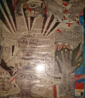
Comment from Doris1022
you have pretty eye and I can see you spent a good bit of time drawing this. is this symbolic to the fact that an artist needs his eyes and hands the most. an extra hand would be good too. lol well done.
  |
you have pretty eye and I can see you spent a good bit of time drawing this. is this symbolic to the fact that an artist needs his eyes and hands the most. an extra hand would be good too. lol well done.
Comment Written 12-Apr-2014
Comment from mrobyn
Exceptional use of contrasting elements, without the overall picture becoming too confused to appreciate. I especially like the touches of blue and read highlighting the sepia/greyscale effects of the rest.I'm sure an art student might spend hours subjecting this to analysis.
 |
Exceptional use of contrasting elements, without the overall picture becoming too confused to appreciate. I especially like the touches of blue and read highlighting the sepia/greyscale effects of the rest.I'm sure an art student might spend hours subjecting this to analysis.
Comment Written 12-Apr-2014