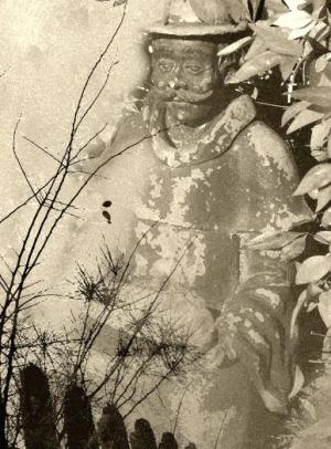
Old Man Autumn
At the end of autumn29 total reviews
Comment from farmgramma
Amazing transformation into this great image. Great colour and lighting. Awesome focus. Great composition and framing. Awesome image. Great work.
reply by the author on 29-Aug-2014
  |
Amazing transformation into this great image. Great colour and lighting. Awesome focus. Great composition and framing. Awesome image. Great work.
Comment Written 25-Aug-2014
reply by the author on 29-Aug-2014
-
Thank you for your review and encouraging comments!
Comment from pmdc2952
I love this image. Very good focus and clarity. I love the lighting on this. Thank You for sharing your work.
reply by the author on 29-Aug-2014
|
I love this image. Very good focus and clarity. I love the lighting on this. Thank You for sharing your work.
Comment Written 25-Aug-2014
reply by the author on 29-Aug-2014
-
Thank you, Your review is important to me.
Comment from bandl
Beautiful work. The sepia color blends all the layer together into a beautiful collage. There are a couple of dark spots in the middle left of the work that are distracting and I don't think add anything to the overall view.
reply by the author on 29-Aug-2014
  |
Beautiful work. The sepia color blends all the layer together into a beautiful collage. There are a couple of dark spots in the middle left of the work that are distracting and I don't think add anything to the overall view.
Comment Written 25-Aug-2014
reply by the author on 29-Aug-2014
-
First I like to apologize for my late reply. Your review is very important to me. I feel honored by your high rating. Thank you!
Comment from Lilibug6
This is really neat! I am intrigued by all the work that went into making this! I have just begun to try layering! Very interesting image! It looks very old! Good focus and blending of all the layers! Good job and thanks for sharing! Lilibug6
reply by the author on 29-Aug-2014
|
This is really neat! I am intrigued by all the work that went into making this! I have just begun to try layering! Very interesting image! It looks very old! Good focus and blending of all the layers! Good job and thanks for sharing! Lilibug6
Comment Written 25-Aug-2014
reply by the author on 29-Aug-2014
-
Thank you very much! Your review is important to me.
I am sorry for my late reply.
-
You are very welcome!
Lili
Comment from jrconrad
Nice use of layers. Every thing looks like it belongs. Very impressive use of technical stuff. I have to tell you, my initial reaction was of a statue of Confucius. Especially the mustache and clothing. Very creative. Cheers, JR
reply by the author on 29-Aug-2014
|
Nice use of layers. Every thing looks like it belongs. Very impressive use of technical stuff. I have to tell you, my initial reaction was of a statue of Confucius. Especially the mustache and clothing. Very creative. Cheers, JR
Comment Written 25-Aug-2014
reply by the author on 29-Aug-2014
-
I apologize for my late reply. Your review is important to me. Thank you!
Comment from dalebraatz
Good job of mixing 4 photos. Haven't tried that yet. Very good creation. Love the technique. Thank you for sharing
reply by the author on 29-Aug-2014
|
Good job of mixing 4 photos. Haven't tried that yet. Very good creation. Love the technique. Thank you for sharing
Comment Written 25-Aug-2014
reply by the author on 29-Aug-2014
-
Thank you very much!
You should try it! It is fun, but needs patience and time.
Comment from Molly Hungar
This is interesting looking I like the statue he looks sad that summer is over as if he is dreaming of days gone by. Very nice work
reply by the author on 29-Aug-2014
|
This is interesting looking I like the statue he looks sad that summer is over as if he is dreaming of days gone by. Very nice work
Comment Written 25-Aug-2014
reply by the author on 29-Aug-2014
-
Thank you Molly,
I like your interpretation. I think he is indeed dreaming of days gone by.
Comment from BStolar
Very nicely done. Good detail throughout. Each complements each other. Good overall lighting in all layers. You blended the layers evenly and it all looks cohesive. Nice job!
reply by the author on 29-Aug-2014
|
Very nicely done. Good detail throughout. Each complements each other. Good overall lighting in all layers. You blended the layers evenly and it all looks cohesive. Nice job!
Comment Written 25-Aug-2014
reply by the author on 29-Aug-2014
-
Thank you very much! Your review is important to me.
Comment from pbabyduck
Well not only do I find this a pleasantly creepy image, with the fireman in among the leave. The only thing that confuses me and it may be my computer since they all view differently you mention that you changed this to sepia I see this as B&W.
reply by the author on 29-Aug-2014
|
Well not only do I find this a pleasantly creepy image, with the fireman in among the leave. The only thing that confuses me and it may be my computer since they all view differently you mention that you changed this to sepia I see this as B&W.
Comment Written 24-Aug-2014
reply by the author on 29-Aug-2014
-
I apologize for my late reply. Thank you for your honest review and your input. There is no fireman in the picture, but a garden statuette of an elderly man in historic clothe. He is wearing a bowl heat. Why you find him creepy? He looks friendly, he is smiling. I converted indeed to sepia and it looks sepia to me even in the thumbnail I see right now. There are many different shades of sepia, just as there are many shades of gray. I used "old paper sepia" which has a brownish tone, The silhouette of curse is dark, because it is a silhouette, which will stay dark in any conversion. If you would change the color curves of the sepia into any other color, blue, green red, or whatever; a silhouette should always stay dark. I hope this answered your question. If not feel free to ask.
-
Please take no offense, I did say pleasantly creepy. And the coloring may be my computer, since all computers due to lighting in them do show differently. The work you have done here is very nice I was just a tad confused on the mention of the color and the statue to me still looks like a fireman, which again is not a bad thing, maybe for me it is suppose to for some reason. I like creepy by the way.
-
I did not take offense at all! I am just curious, creepy or plesantly creepy does not make a difference. [I actually do not understand how you mean that. Do the words pleasant and creepy just mean the opposite of each other?] Creepy is in my opinion something like you see at Halloween.
I do not have [or ever had] a desktop computer, just a laptop. I have experienced that the screen of my laptop shows colors different when looked at it from different angles.
Comment from Mara del Mar
A great piece of mixed media. I love the color and harmony of the scene. Nice lighting, good balance of the composition and beautiful presentation. Love the concept y the great amount of textures. Good job. Luck.
Mara
reply by the author on 29-Aug-2014
|
A great piece of mixed media. I love the color and harmony of the scene. Nice lighting, good balance of the composition and beautiful presentation. Love the concept y the great amount of textures. Good job. Luck.
Mara
Comment Written 24-Aug-2014
reply by the author on 29-Aug-2014
-
Thank you Mara! Your review is very important to me! I am sorry for my late reply.