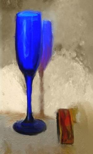
Colored Shadows
Still Life25 total reviews
Comment from Anna McNiffe
The blue reflection of the glass on the wall is excellent. Good composition and the muted
colors are a good contrast. The little red item is well positioned and an excellent choice ,
Very nice work and the blue glass is superb.
.
reply by the author on 15-Feb-2015
  |
The blue reflection of the glass on the wall is excellent. Good composition and the muted
colors are a good contrast. The little red item is well positioned and an excellent choice ,
Very nice work and the blue glass is superb.
.
Comment Written 15-Feb-2015
reply by the author on 15-Feb-2015
-
Thank you, Your kind comment is very much appreciated.
Comment from jesuel
What a beautiful piece of art the color composition is great the design is very creative and unique even down to the shadow fine work here
reply by the author on 15-Feb-2015
|
What a beautiful piece of art the color composition is great the design is very creative and unique even down to the shadow fine work here
Comment Written 15-Feb-2015
reply by the author on 15-Feb-2015
-
Thank you very much! I appreciate your kind review.
Comment from Joelgraphuchin
Initial impact: beautiful artwork
Creativity of presentation: idea of blue shadow is cool
Color Harmony: eye pleasing
Center of Interest: clearly defined through color and placement of element
Technical Excellence: smart choice of color
reply by the author on 15-Feb-2015
|
Initial impact: beautiful artwork
Creativity of presentation: idea of blue shadow is cool
Color Harmony: eye pleasing
Center of Interest: clearly defined through color and placement of element
Technical Excellence: smart choice of color
Comment Written 15-Feb-2015
reply by the author on 15-Feb-2015
-
Thank you very much for your kind and encouraging comments.
Comment from Jean A Cormier
Ah, yes, C___85 I see your handiwork here-would be surprised if not yours! Excellent idea for the contest theme and the blue and amber palette with the neutral background is a good choice. The shadows cast seem to be right on target regarding placement, particularly the one in the forefront. The blue shadow well proportioned seems a bit dense and possibly could be diffused a tad, but this is lovely! jean
reply by the author on 15-Feb-2015
|
Ah, yes, C___85 I see your handiwork here-would be surprised if not yours! Excellent idea for the contest theme and the blue and amber palette with the neutral background is a good choice. The shadows cast seem to be right on target regarding placement, particularly the one in the forefront. The blue shadow well proportioned seems a bit dense and possibly could be diffused a tad, but this is lovely! jean
Comment Written 15-Feb-2015
reply by the author on 15-Feb-2015
-
Thank you very much! Well you caught me again. I thought you would. I will look at the blue shadow. I have an idea how to diffuse it when the contest is over.
Comment from Lilibug6
This is very nice! The colors are very nice! The blending and shading are great! The background is very nice! Well done and thanks for sharing! Lilibug6
This rating does not count towards story rating or author rank.
The highest and the lowest rating are not included in calculations.
reply by the author on 15-Feb-2015
|
This is very nice! The colors are very nice! The blending and shading are great! The background is very nice! Well done and thanks for sharing! Lilibug6
This rating does not count towards story rating or author rank.
The highest and the lowest rating are not included in calculations.
Comment Written 15-Feb-2015
reply by the author on 15-Feb-2015
-
Thank you very much for your encouraging comments
-
My pleasure! Lili