been around a long long year
a photo of my drawing15 total reviews
Comment from cleo85
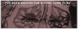
The line from the song tells me, that this was planned as entry for the contest Sympathy for the Devil, but something went wrong with the upload. It got not in the contest, but is just a normal post now.
Something also went wrong with the category because it is posted as Experimental Digital Art. Since this piece is apparently your own drawing, it has to be posted as Traditional Art, as I know from own experience. Any digital version created from your own art is still Traditional Art and has to be posted as such on FAR, even when digital filters are used and text is added.
I think your idea to use this artwork as illustration for the song is as unusual as it is fitting.
I believe the upload does not justice to the original art. The piece appears un-sharp. I have seen this lately happen to other traditional artworks including my own. Usually it helps to increase the exposure or the contrast of your piece in your photo editing program.
If you have re-sized the piece, try to upload the original size. That may corrects the error as well.
I really do not know exactly how to rate your piece in fairness. I do not want that a technical error is mistaken for an artistic flaw. Since I have seen other artworks you created and know about your talent and skills, I rate as I believe the piece looks in the original.
reply by the author on 26-Oct-2017
  |
The line from the song tells me, that this was planned as entry for the contest Sympathy for the Devil, but something went wrong with the upload. It got not in the contest, but is just a normal post now.
Something also went wrong with the category because it is posted as Experimental Digital Art. Since this piece is apparently your own drawing, it has to be posted as Traditional Art, as I know from own experience. Any digital version created from your own art is still Traditional Art and has to be posted as such on FAR, even when digital filters are used and text is added.
I think your idea to use this artwork as illustration for the song is as unusual as it is fitting.
I believe the upload does not justice to the original art. The piece appears un-sharp. I have seen this lately happen to other traditional artworks including my own. Usually it helps to increase the exposure or the contrast of your piece in your photo editing program.
If you have re-sized the piece, try to upload the original size. That may corrects the error as well.
I really do not know exactly how to rate your piece in fairness. I do not want that a technical error is mistaken for an artistic flaw. Since I have seen other artworks you created and know about your talent and skills, I rate as I believe the piece looks in the original.
Comment Written 24-Oct-2017
reply by the author on 26-Oct-2017
-
Cleo,
Thank you for having taken the time to look and then write me with you opinion on my work and presentation. All of you time in doing so is appreciated.
-
You're most welcome! :o)
Comment from Trajan
Hm..not sure about this one.
It tis quite haunting actually, with just the eyes. It looks like scary clown eyes piercing into one's soul.
A little too dark on the right, but an interesting and thought provoking image nonetheless.
Good luck in the contest.
This rating does not count towards story rating or author rank.
The highest and the lowest rating are not included in calculations.
reply by the author on 26-Oct-2017
  |
Hm..not sure about this one.
It tis quite haunting actually, with just the eyes. It looks like scary clown eyes piercing into one's soul.
A little too dark on the right, but an interesting and thought provoking image nonetheless.
Good luck in the contest.
This rating does not count towards story rating or author rank.
The highest and the lowest rating are not included in calculations.
Comment Written 24-Oct-2017
reply by the author on 26-Oct-2017
-
Trajan,
Thank you for having taken the time to look and then write me with you opinion on my work and presentation. All of you time in doing so is appreciated. Can you better explain the reduction, the 1/2 star rating?
-
Hi! As I said previously, it?s a little underexposed if you will and needs more contrast to give it a lot of pop.
This can be adjusted in most software quite easily
Comment from MKFlood
Pretty cool penmaster. I like the reflection in the font. Sthe shading is great. The details is great. The depth is great. The creation is balance and eye appealing to the viewer. Creative and great job overall
reply by the author on 26-Oct-2017
|
Pretty cool penmaster. I like the reflection in the font. Sthe shading is great. The details is great. The depth is great. The creation is balance and eye appealing to the viewer. Creative and great job overall
Comment Written 24-Oct-2017
reply by the author on 26-Oct-2017
-
MK Flood,
Thank you for having taken the time to look and then write me with you opinion on my work and presentation. All of you time in doing so is appreciated.
Comment from Linda Wetzel
Very creative and original idea for this contest. I like the masked eyes...so symbolic of the many faces of Lucifer. Best wishes in this contest.
reply by the author on 26-Oct-2017
|
Very creative and original idea for this contest. I like the masked eyes...so symbolic of the many faces of Lucifer. Best wishes in this contest.
Comment Written 24-Oct-2017
reply by the author on 26-Oct-2017
-
Linda Welzel,
Thank you for having taken the time to look and then write me with you opinion on my work and presentation. All of you time in doing so is appreciated.
-
My pleasure. I enjoyed your portfolio.
Comment from Yogendra R Modak
Wow,great experimental digital art formed by artist.the Eyebrow elliptical view with patches of shade's looking well to focus view .The letter on twins well markable on it ,great digital art ,great digital artist.
This rating does not count towards story rating or author rank.
The highest and the lowest rating are not included in calculations.
reply by the author on 26-Oct-2017
|
Wow,great experimental digital art formed by artist.the Eyebrow elliptical view with patches of shade's looking well to focus view .The letter on twins well markable on it ,great digital art ,great digital artist.
This rating does not count towards story rating or author rank.
The highest and the lowest rating are not included in calculations.
Comment Written 24-Oct-2017
reply by the author on 26-Oct-2017
-
Yogendra R Modak,
Thank you for having taken the time to look and then write me with you opinion on my work and presentation. All of you time in doing so is appreciated.
-
Thank you so much gor your great reaply👏