Pooh Project
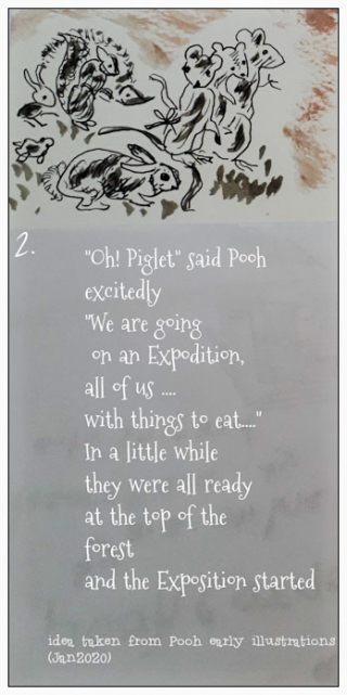
Viewing comments for Page 4 "No. 2 Pooh's friends gather"Winnie the Pooh retro art from 1926>
5 total reviews
Comment from MKFlood
I don't think you will have an issue with the art. Still I would check on the copyrights on the story. Cute Lil drawing. The body forms and language is good. The details is good. the shading is good. The depth is good. The facial expressions is ok. The creation is balance and eye appealing to the viewer. Still it's creative and good job overall
reply by the author on 05-Feb-2020
  |
I don't think you will have an issue with the art. Still I would check on the copyrights on the story. Cute Lil drawing. The body forms and language is good. The details is good. the shading is good. The depth is good. The facial expressions is ok. The creation is balance and eye appealing to the viewer. Still it's creative and good job overall
Comment Written 04-Feb-2020
reply by the author on 05-Feb-2020
-
Thanks for that... early days,so still investigating.
Comment from iPhone7
This is an excellent work Brenda. I just read that this is Number 2 in a series of six. I will go and check out the cover and number 1 here shortly.
What a great project. I am looking forward to seeing the rest of the illustrations.
Great work Brenda ~ Steve
reply by the author on 26-Jan-2020
|
This is an excellent work Brenda. I just read that this is Number 2 in a series of six. I will go and check out the cover and number 1 here shortly.
What a great project. I am looking forward to seeing the rest of the illustrations.
Great work Brenda ~ Steve
Comment Written 25-Jan-2020
reply by the author on 26-Jan-2020
-
Thank you again Steve for your interest and review. Very much appreciated.
Comment from avmurray
This is not going to be a long review Brenda, because what I have said in the former review also goes for this one. I just wanted to add one little details I was thinking of after the last review. It is about the last line in Your text starting With "idea taken from Pooh". I think the letters could be even smaller, and perhaps in black ? Just an idea.
reply by the author on 26-Jan-2020
|
This is not going to be a long review Brenda, because what I have said in the former review also goes for this one. I just wanted to add one little details I was thinking of after the last review. It is about the last line in Your text starting With "idea taken from Pooh". I think the letters could be even smaller, and perhaps in black ? Just an idea.
Comment Written 25-Jan-2020
reply by the author on 26-Jan-2020
-
Yes Anne that is a good idea .. I am printing out my reviews on this as some excellent feedback received. I am so grateful and hope to incorporate a lot of the hints,and tips. Again a big thanks.
-
You are more than welcome Brenda.
Comment from Dick Lee Shia
Nice continuation of a series...
Is this the same dynamic font that I previously reviewed?
Better do the shading in a subtle finer way so it will be visually soothing. I guess the rose colored backdrop is more appealing or something darker so the the texts would come out more visible...something that kids love to read.
Nice tall format.
reply by the author on 25-Jan-2020
|
Nice continuation of a series...
Is this the same dynamic font that I previously reviewed?
Better do the shading in a subtle finer way so it will be visually soothing. I guess the rose colored backdrop is more appealing or something darker so the the texts would come out more visible...something that kids love to read.
Nice tall format.
Comment Written 24-Jan-2020
reply by the author on 25-Jan-2020
-
Yours is the second pointer i have received on colour and text visibility abd I am taking it on board. Probably in the next posts i will experiment with colour and sizing. This is all very helpful and I thank you for your valuable insights and useful critique.
-
I like the previous dynamic fonts!
Kids would love to read words with jumping letters! ;-)
-
Ok that's a useful hint. Taken on board. I am making notes of all this help big thanks again.
Comment from Renate-Bertodi
I use purple more often than I should, I think. I was given a ticking off at art college: we english do not use orange skies and ... we use grey and brown and green etc. I have got over that, quickly got back to my 'hungarian style' colour pallete which I inherited from my mother, who adored colour. The only thing I would say is that pink and purple are of the same package so dont really stand out a lot, if you are being serious and you know, now a days, everything has to be in your face, or it isn't worth a farthing.
reply by the author on 24-Jan-2020
|
I use purple more often than I should, I think. I was given a ticking off at art college: we english do not use orange skies and ... we use grey and brown and green etc. I have got over that, quickly got back to my 'hungarian style' colour pallete which I inherited from my mother, who adored colour. The only thing I would say is that pink and purple are of the same package so dont really stand out a lot, if you are being serious and you know, now a days, everything has to be in your face, or it isn't worth a farthing.
Comment Written 24-Jan-2020
reply by the author on 24-Jan-2020
-
I love strong colours too been told by galleries the lighter watery and past shades stuff sells better. But colour is me like you. However here I pick up your point that this colouring might outstump the story and detract so I am very grateful for your hint and tip... your review as always much appreciated. I will repost this in line with my other Mockups.